
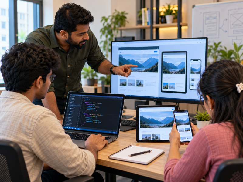
Open a website on your laptop. Now open the same website on your mobile phone. Does it look the same? Probably not.
The menu may change. Images may become smaller. Columns may turn into a single layout. Buttons may also move to different positions.
This happens because websites need to work on different screen sizes.
Today, people use mobile phones, tablets, laptops, and desktop computers to access websites. Therefore, developers must create layouts that adjust to different devices.
This is where responsive web design becomes important.
For students learning HTML, CSS, and JavaScript, mobile-first development is a useful skill. The Best software Training Institute in Hadapsar can help students understand these concepts through practical website-building exercises.
What Is Responsive Web Design?
Responsive web design means creating websites that adjust their layout according to the screen size.
For example, imagine an online shopping website.
On a desktop, the website may display four products in one row. However, on a mobile phone, showing four products in the same row would make everything too small.
A responsive layout may show only two products or one product per row.
The website adjusts to the available space.
Responsive design helps websites remain useful across different devices without needing a separate website for every screen size.
It can include:
- Flexible page layouts.
- Images that adjust to screen width.
- Text that remains easy to read.
- Menus that work on smaller screens.
- Buttons that are easy to tap.
- Content that does not overflow.
As a result, users can access the same website on different devices with a better experience.
What Does Mobile-First Development Mean?
Mobile-first development means designing the website for smaller screens before adding features for larger screens.
Instead of starting with a large desktop layout, developers begin with the mobile version.
They focus on the most important content and features first.
For example, a mobile shopping page may need:
- A clear product image.
- A product name.
- A visible price.
- An easy-to-use purchase button.
- Simple navigation.
Once the mobile layout works well, developers can add more space and extra layout features for tablets and desktops.
This approach encourages students to think carefully about what users need most.
Why Is Mobile-First Design Useful?
Mobile screens have limited space.
Therefore, developers must decide which information deserves attention.
They cannot simply place every element on a small screen and expect users to understand it.
Instead, they need to organise content clearly.
Moreover, mobile-first development can help developers build layouts that grow with larger screens.
Why Do Websites Look Different on Different Devices?
Every device has different screen dimensions.
A desktop monitor may offer plenty of horizontal space. In contrast, a mobile phone has a much narrower screen.
This difference affects how content should appear.
Consider a website with three columns.
On a desktop, all three columns may fit comfortably.
However, on a mobile phone, the columns may become too narrow. Text can look crowded, and buttons may become difficult to use.
A responsive layout changes the arrangement to suit the available space.
For example:
Desktop: Three columns side by side.
Tablet: Two columns.
Mobile: One column.
This is a simple example of how responsive design works.
However, developers should not focus only on screen width. They should also consider text size, spacing, images, navigation, and user interaction.
Important Concepts Behind Responsive Web Design
Students should understand a few basic concepts before building responsive websites.
1. Flexible Layouts
A flexible layout adjusts according to the available screen space.
CSS Grid and Flexbox are useful tools for creating these layouts.
For example, Flexbox can help arrange navigation items in a row. On a smaller screen, the layout can change to fit the available width.
Similarly, CSS Grid can help create product galleries and content sections that adjust to different screen sizes.
2. CSS Media Queries
Media queries allow developers to apply different CSS rules based on screen conditions.
For example, a website may use three columns on a large screen and one column on a mobile screen.
A simple example:
.container {
  display: grid;
  grid-template-columns: repeat(3, 1fr);
  gap: 20px;
}

@media (max-width: 768px) {
  .container {
    grid-template-columns: 1fr;
  }
}
Here, the layout changes when the screen width becomes 768 pixels or less.
This is one of the basic techniques used in responsive web development.
3. Flexible Images
Large images can create problems on smaller screens.
For example, an image may extend beyond the screen and create unwanted horizontal scrolling.
Developers can use CSS to make images fit their containers.
A common example is:
img {
  max-width: 100%;
  height: auto;
}
This helps images adjust to the available width while keeping their proportions.
4. Responsive Typography
Text should remain easy to read on different devices.
A heading that looks good on a desktop may take up too much space on a mobile screen.
Therefore, developers should use suitable font sizes and spacing.
CSS techniques such as relative units and clamp() can help create text that adjusts within a defined size range.
5. Viewport Settings
Websites should include the correct viewport setting so that mobile browsers display the page at the expected device width.
A common HTML setting is:
<meta name="viewport" content="width=device-width, initial-scale=1.0">Without suitable viewport settings, a mobile browser may display the page in an unexpected way.
This small detail can make a major difference to the mobile layout.
Common Responsive Design Mistakes IT Students Should Avoid
A website may look good on one screen but still fail on another.
Here are some common mistakes students should watch for.
Designing Only for Desktop
Many beginners build a desktop website first and leave mobile adjustments until the end.
However, this can create extra work.
Some layouts may need major changes before they fit smaller screens.
Instead, students should plan for different screen sizes from the beginning.
Using Fixed Widths Everywhere
A fixed width may work on one screen but cause overflow on another.
For example, a container set to 1,200 pixels may not fit on a smaller device.
Flexible widths and suitable maximum widths can help avoid this problem.
Making Buttons Too Small
Mobile users interact with websites through touch.
Therefore, buttons need enough space to be tapped comfortably.
Small controls placed too close together can make a website frustrating to use.
Ignoring Horizontal Scrolling
A responsive website should not create unnecessary horizontal scrolling.
This problem often appears when developers use fixed-width elements or large images.
Students should check every important section on smaller screens.
Hiding Too Much Content
Mobile design does not mean removing all useful information.
Instead, developers should arrange content based on importance.
Users should still be able to access the information and features they need.
Testing Only One Mobile Screen
Different phones have different screen sizes.
Therefore, testing only one device is not enough.
Students should check several screen widths and observe how the layout changes.
How Can IT Students Practise Mobile-First Web Design?
Students can learn responsive design through small projects.
These exercises help them understand how CSS affects the layout.
Exercise 1: Build a Responsive Navigation Menu
Create a simple website navigation menu.
On a desktop, display the links in a horizontal row.
On a smaller screen, change the layout to a compact menu.
This teaches students how to adapt navigation for different devices.
Exercise 2: Create a Responsive Product Gallery
Build a page that displays several products.
Use CSS Grid to show three or four products on a desktop.
Next, adjust the layout for tablets and mobile phones.
Check whether images, prices, and buttons remain easy to view.
Exercise 3: Design a Mobile-First Landing Page
Start with a mobile screen.
Add a heading, short description, image, and call-to-action button.
Once the mobile layout is complete, expand it for larger screens.
This exercise teaches students how to organise content before adding extra design elements.
Exercise 4: Test Different Screen Sizes
Open your website in a browser.
Use the developer tools to test different screen widths.
Try a small phone size, a tablet size, and a desktop size.
Look for:
- Text that becomes too small.
- Images that overflow.
- Buttons that are difficult to tap.
- Sections that overlap.
- Unwanted horizontal scrolling.
Then correct the problems.
Exercise 5: Rebuild a Non-Responsive Website
Find a simple webpage that does not work well on mobile screens.
Create your own improved version.
Compare both layouts.
This exercise helps students understand the real value of responsive design.
Why Does Responsive Design Matter in Real IT Jobs?
Responsive design is useful across many types of web development work.
Frontend developers use it while building websites, dashboards, online stores, and web applications.
Website developers need to make sure that pages remain usable on different devices.
UI developers work with layouts, menus, forms, and content sections that must adapt to screen sizes.
Even developers working on large business applications need to understand how users access their software.
For example, an employee may use a company dashboard on a desktop at work and a mobile phone while travelling.
The application should remain useful in both situations.
Therefore, responsive design is not just a visual skill. It is an important part of practical web development.
How the Best software Training Institute in Hadapsar Can Teach Responsive Design
Students understand responsive design better when they build and test actual websites.
At the Best software Training Institute in Hadapsar, students can learn HTML, CSS, Flexbox, Grid, and media queries through practical projects.
For example, they can create a landing page, test it on different screen sizes, and improve its layout.
Next, they can build responsive navigation menus, product galleries, and contact forms.
Trainers can also help students identify common layout problems and correct them.
This practical approach connects classroom learning with real web development tasks.
Students interested in developing their web design and programming skills can explore Floating Minds Institute and its IT training opportunities.
Common Questions About Responsive Web Design
Is responsive web design necessary for every website?
Most modern websites should work well across different devices. Responsive layouts help provide a consistent experience.
Is mobile-first design the same as responsive design?
No. Responsive design means adapting layouts to different screens. Mobile-first is an approach that starts with the smallest screen and expands to larger ones.
Do developers need JavaScript for responsive design?
Not always. HTML and CSS can handle many responsive layouts. JavaScript may be useful for interactive features such as mobile navigation menus.
Which CSS tools should beginners learn first?
Start with Flexbox, CSS Grid, relative units, and media queries. These provide a strong foundation.
How can students test responsive websites?
They can use browser developer tools, resize the browser window, and test on actual phones and tablets.
Final Thoughts: Build Websites That Work Everywhere
A good website should not work only on a laptop.
It should also remain clear and useful on mobile phones, tablets, and other screen sizes.
Responsive web design helps developers achieve this through flexible layouts, suitable images, readable text, and well-planned navigation.
For IT students, learning these concepts can improve both their technical skills and their understanding of real users.
The Best software Training Institute in Hadapsar can help students develop this knowledge through practical HTML, CSS, and frontend development projects.
Because modern web development is not just about creating a beautiful desktop website.
It is about building websites that people can use comfortably, wherever they access them.


